01Live figure
Every margin, seen.
A recovered-margin figure and trend line stand in for the claim. Feels like a financial product; speaks directly to the CFO.
Data-ledCFO audience
 Look book

A design reference for Matriarch - mock-ups, style guides and ideas in one place. Browse, pick, and tell us what to develop next.
A recovered-margin figure and trend line stand in for the claim. Feels like a financial product; speaks directly to the CFO.
A real notification replaces the weekly report. The most operational of the six - shows the product working in the moment.

The old "5 / 3 / 0" line is struck through; a single full-frame "1" carries the answer. Boldest typographic read of the set.

Palette flipped so the ad stops the scroll in a dark-heavy feed. Same system, highest contrast against surrounding content.
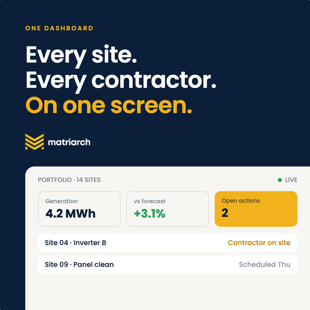
A dashboard fragment does the persuading. Best fit if the goal is demo bookings from people who want to see the product first.

The mark becomes the hero and copy drops to one line. Quietest of the set; builds brand recognition rather than driving a click.
Same layout as 06. The three chevrons drop in from above, one after another, and settle into place - a 2-second opener for feed video or HTML5 placements.
This will be our rolling reference guide for as long as we are friends.
matriarch@correlatedigital.com